Pages

Sunday, February 27, 2011

Chena and Escape Kitty

Have you been following the adventures of Escape Kitty (EK) on Scrapbook.com?  My good friend, Jennifer (jrabs) has a cat that is trying desperately to escape the confines of her house.  Poor sweet EK longs to be outdoors but alas, Wiley Coyote, has been spotted so EK is destined to be an indoor kitty.  Jennifer posted a challenge to do an Escape LO of whatever is your escape and I thought it would be fun to do a LO of Chena and EK.  EK has her bags packed and is waiting patiently by the door for Chena to pick her up in her mobile doghouse and they are off to Alaska.  HA-ha, they don't know that it is still really cold in Alaska and the ground is covered with snow.  They are in for a BIG suprise.  And geez, Chena has never driven in the snow before.  I sure hope they make the jouney safely.  I told Chena to be sure not to let EK eat any birds but I think the birds will be safe as there are only 6 species that spend the winter in Alaska so the hunting will be sparse for EK!  LOL, Chena put lots of cat food in the doghouse for EK!


Journal says:  EK, come travel with me in my mobile doghouse.   I've been from coast to coast, Florida to Nova Scotia, and all the way to Alaska.

Supplies
Base paper – MME Lost & Found Union Square Perfect Damask Print

Other papers – 6x6 BAsicGrey pad, Capella
Bingo Boards and Calling Cards – Tattered Angels
Vine – Reflections
Flowers – Prima & handmade
Escape letters – BasicGrey Max & Wiskers
Fence – layered Sizzix diecut painted with white crackle paint and Crackle Accents, inked with Antique linen distress paint
Suitcase pile – Tattered Angels glimmer chips
Burlap fabric
Key & Bookplate - MM Vintage Findings
Prima flower ribbon


Friday, February 25, 2011

Imagine & antiquing a frame


Every now and then I do something that I really ,really like and this is one of those!  I just love the way that the Dusty Attic Frame turned out on this, IRL, it is soooo pretty and french antique looking!  I did this layout for the February  sketch challenge at Dusty Attic.

The journal says:  This photo was taken shortly before Mom and Dad were married.  Did they imagine that they would be married for more than 67 years?  Today, they are almost 89 years old and they are still working on their love story.

 
Method for Antiquing the Frame
The effects I used on the frame are really easy and here's how I did it.  First I painted the frame with clear Gesso so that my acrylic paint would adhere better.  I used Plaid Antique White acrylic paint and I applied 2 coats.  After that dried I used Ranger Crackle Accents and applied a heavy coat on the frame with a paintbrush.  I let that dry for several hours and then I rubbed Distress Antique Linen ink into the cracks.  That still didn't quite give me the effect I wanted so I rubbed Ranger Copper Perfect Pearls into the cracks and it was Perfect, LOL!!  The perfect pearls gave the frame a nice sheen.

Layout Supplies:

BasicGrrey Curio –
• Needle Lace – back pp
• Ophelia – floral rectangle
Bazzill CS – french vanilla
- peach
Glitz – Vintage paper layers – printed pp
Kaisercraft pearls- chocolate colored
Prima e. – black and peach pearls
Dusty Attic frame
Kaisercraft rubons – Devonshire collection “Imagine”
half flower – Petaloo
Other handmade with Alterations Tattered florals
McGill starburst punch &  leaf punch
Colorbox cates eye ink –
• bisque
• olive
Distress ink –
• forest moss
• wild honey
• antique linen
• black
Ranger alcohol ink – pitch black
Tsukineko Fantastix brush point coloring tool
Martha Stewart edge punch
Venetian lace – Lace Heaven
Glimmer mist –
• sunkissed peach
• olive vine
Ranger perfect pearls – perfect copper
Plaid acrylic paint- antique white
Gesso
Autumn leaves clear stamps - journaling stamp

Wednesday, February 23, 2011

Homeward Bound

I haven't done a layout like this is a long  time and I really enjoyed doing it!  I love to journal and here I tell part of the story of our trip home from Alaska.  Did this for a challenge at Sisterhood of Scrap and its a Pagemaps sketch.

The Cassiar Highway has two claims to fame. It is said to be one of the worst routes to Alaska and you are advised to take spare tires and drive SLOW. Second, it is heralded as being of unsurpassed beauty. For me, the thought of a drive full of scenic wonder caught my attention and for Dick, well who doesn’t love a challenge! So when we moved back to the lower 48 in 2000, we decided we would take the Cassiar route to Denver. About 10 miles into that trip, we had had enough. To be fair, we were driving a ¾-ton pickup with a Bigfoot camper on it, pulling a loaded trailer full of Dick’s tools and his ’22 Ford, and we weighed in at 22,000 lbs. We were just too heavy to deal with the potholes and extreme grades of the Cassiar so we reluctantly turned that rig around and headed down the Alaska Highway.


Fast-forward to 2010, the year of our return to Alaska, and we were determined to drive the Cassiar and decided to take that route on our way home in August. Can you just imagine how we felt when we heard that the Cassiar was closed because of forest fires? We got to the turnoff for the Cassiar, and sure enough, the road was closed. But, there was a long lime up of cars, RVs and a few motorcycles. There’s a gas station there at the corner and we learned that the road was going to open in about 30 minutes and we would be escorted through the forest fire in a convoy. Ah, talk about timing!

Our drive through the fire was uneventful; we didn’t see much in the way of flames, just the devastation left behind from a fast moving fire through the stands of black spruce. There are always many fires burning in the summer throughout the wildernesses of the northwest and many are left to nature’s whim as long as the fires are not a threat to population centers. The Cassiar runs through complete wilderness – we had no cell phone service the entire 450 mile route. There are only a few small settlements along the way. We camped in the parking lot of a store selling jade the first night. The 2nd night we spent in Stewart, BC which is a 38-mile jaunt off the Cassiar. Hyder, AK is just another mile or so from Stewart and we went there for some excellent bear viewing at Fish Creek.

Just as a postscript, the Cassiar has been greatly improved since our attempt in 2000. It is a gorgeous drive and the road is very accessible to all RV’s.

And this page accompanies the above.   My inspiration was a sketch by my good friend, Ali.   Journal:

We started our drive home on August 4, 2010. We made a quick stop in Anchorage to provision before hitting the wilderness of the Cassiar Highway where there are very few services. We stopped at the Commissary to buy groceries for the two-week trip home and the PX to buy Christmas presents and souvenirs! These two pictures were taken along the Glenn Highway and that is Mt. Drum in the distance at the top and at the bottom is the ever-present fireweed, so named because it is the first plant to return after a forest fire.

Stewart, BC is a Canadian border town at the end of the Portland Canal, a narrow saltwater fjiord about 90 miles long. The fijord is a natural boundry between Alaska and Canada. The town is surrounded by high peaks and glaciers freely flow down the slopes. These pictures are of the Salmon Glacier, the 5th largest glacier in the world. It is unfortunate that the weather was so poor when we were there, however, we did get the occasional break in the clouds that allowed us to see the glacier.


I used MME So Sophie papers for both of these layouts.  The little flowers are forever old and they are Fancy Pants.  The diecut is from Bo Bunny Flutterbutter and is cut in half.    The letters are cut with the Alterations Vintage Market sizzlet.

TFL!


Tuesday, February 22, 2011

Give me a Kiss on which to Build a Dream

I did this for the Feb butterfly challenge we have at Swirlydoos.  I love this picture of my parents, there's a romantic story behind it.  The two pictures are the same but the one at the bottom that looks all tattered is a scan of the actual photo that my Dad kept in his wallet thoughout his time overseas during WWII.  They were married before Dad went overseas, I think this is so sweet!


Supplies:

TPC Studio – Grandma’s Attic –

• Vintage Stripe back pp
• Grandma's Attic Trinkets , half sheet & large brown scallops
• Mirror with title on it
Photo mats – MM Paper Reverie Brun Antique Dictionary
Die cut – Creative Imaginations Remember Ledger – used backside
Petaloo layered flowers, Prima jrweled flower in the center
MM Paper Reverie Brun Antique small resin flower & clear facet teardrops
Martha Stewart punches
Reflections mint green flower center brads
K & Co large butterfly – Tim Coffey Blossomwood
Unknown – beads,
MLYB – bag of feathers

Monday, February 21, 2011

SISTERS - Swirlydoos Feb kit


This is a layout I did for a round robin challenge at Swirlydoos. I started out with a base sheet of G45 Timeless Collection Core'dinations which I sanded around the edges to reveal the brocade design.  Then  I did alot of water distressing on the remaining layers which are TPC STudios Grandma's Attic. The three inner sheets are cut at 7", 6", and 5" and distressed by dampening the edges of the papers with my fingers and then folding and bunching the dampened edges.  The swirls are Tim Holtz grungeboard painted with Tattered Leather Glimmer Mist.  The key on the left is heat embossed with UTEE.  While the UTEE is still hot, I sprinkled on Distress walnut stain embossing powder to give it that aged look.  TFL!!


Supplies:
Base paper - Core’dinations G45 Timeless Collection

TPC Studios – Grandma’s Attic Collection
• Large sheet – Hidden Treasures
• Bottom small sheet – Reflections
• Next layer small – Homespun
• Top layer – Homespun
Remember Tag – made from Creative Imaginations Remember Ledger pp
Swirls – T Holtz grungeboard painted with Tattered leather Glimmer Mist
Pearl swirls – Prima
Pearls – Kaisercraft
Flowers – Petaloo
Large flower centers – Prima
Small flower centers – MME Lost & Found brads
letters – Alterations diecut
Key – Dusty Attic heat embossed with Gold Utee and Distress walnut stain
Prima lace bottom left and right
Unknown - Velvet ribbon , stick pins


Wednesday, February 16, 2011

Garden of the Gods

This is a scraplift from Sherrenae, RR entry at Swirlydoos, and I just love this design!  Even though I wasn't on her RR team I decided to scraplift it anyway!  Photo is of me and dear friends at Garden of the Gods in Colorado Springs.  You should definitely go there if you're anywhere near as it is show stopper gorgeous.


I am just now using my Swirlydoos November kit and I do love it.  It is all about using inks to color the resist stamped pages.  for this layout I used:

Letters Bo Bunny Flutter Butter & BasicGrey

BG pp – Heidi Swapp Invisibles circle frame
Inner circle – Glitz Vintage Love Strip
Printed flowers – Prima
Yellow Flower made with Bazzill dotted swiss and Alterations tattered flower die
Leaves cut with McGill Punch
MM journal spot
PP inked with Distress Ink:
• Wild Honey
• Tumbled glass
• Vintage photo
• Faded jeans
• Brushed corduroy
Leaves inked with Cats Eye Olive and lime pastel, then painted with green Donna Salazar colors Smooch Spritz

Dusty Attic chipboard painted with:
Plaid Keepsake Colors – Maple Syrup
Tattered Angels - peacock chalkboard glimmer mist
- Tattered Leather
Cats Eye Olive and lime pastel
Smooch Spritz Donna Salazar colors -green

The Soldier Returns

I love this picture of my parents that was taken shortly after Dad came home from WW II.  They were out for a night on the town in Washington, DC.  The little card on the right is a scan I made of the folder that the picture was kept in.  What a time that must have been with all those soldiers coming home from the war, it was a celebration indeed!

I used the new G45 Curtain Call papers for this layout plus a sheet of Fashionista (that's the brightly colored paper peaking out under the photo.  I found an image of a newspaper headline proclaiming the end of the war in Europe.  Dad went to Paris shortly after Paris was liberated and so I thought this paper particularly on point for this!  This is the 4th time I've scrapped this photo, this is my favorite so far.   I did 2 layouts of this photo for my brothers and I did one for myself along time ago that needed to be redone!


G45 Curtain Call collection

Back paper – Curtain Call
Piano keys – Let’s Dance
Stamp border – Tour de France
PP under floral pp – Pantomime
Floral – Fashionista Collection, Potpourri
Images in center of flowers – Pantomime
Band director cut-out - Let’s Dance
Red CS – Bazzill
Alterations Die to cut rosettes
Creative Charms Vintage Accents – metal flower centers with watch glass
Casino Royal – Scan of actual picture folder that the photo was in
VE Day headline – downloaded from internet
The – Cosmos Cricket Tiny Type
Soldier Returns letters – Cricut Printing Press Cartridge
Distress ink – Wild honey
- black soot
- vintage photo

Tuesday, February 15, 2011

PSE - Using the Skew tool to improve our LO presentation

We are always photographing our LOs to share with our online friends and sometimes we can't get a full on shot of them and end up with somethings besides the LO showing, like this:

I don't  like it when part of my background shows in my layouts so here's how to get rid of it.


First crop the picture as tightly as you can using the crop tool. (5th tool down on the inside in my photo)


Then, go to Image, Transform, Skew in the tool bar at the top.

 Grab the corners of your image and pull them out to stretch your photo, thus eliminating the background from your image.
 When you are satisfied with the look, click on the green arrow at the bottom of your image.

And that's all there is to it.  Your layouts will always look better if you have eliminated the "background noise."


Sunday, February 13, 2011

Scrap That contest

A shout out for one of my favorite SB artists, Janis Madina Maginahay, and a DT member at Scrap That.

I've always loved Janis's bright colors and fun style!  There's a little contest going on at Scrap That where I needed to pick my favorite DT Feb project and I have to say that  that is impossible because all the projects are awesome in their own way so I picked this one from Janis, only because I always loved her work that she posted on another site where I was on the DT.  Everyone's work at Scrap That is great!

Check out the blog of Scrap That! here and the store, here.  The kits look awesome!  There's a great forum with some fun challenges going on too. Check it out, Scrap That! forum

Fly

Several years ago I attended the wedding of my poodle's breeder's daughter.  The theme of the wedding was medieval and everything was beautiful.  It was extra special to me because you all know how much I love dogs and Saber and Fifi, brother and sister standard poodles, were the ring bearer and the flower girl.  Now, as a child, I had this fairytale dream in my head of getting married and having a long flowing train that my dogs would  carry down the aisle for me.  I think that idea must have come from seeing Lady and the Tramp!  Anyway,  they were both perfect little attendants and sat very quietly and still throughout the entire ceremony which was about 45 minutes long.  About 20 minutes into the ceremony, Fifi sat her little flower basket down in front of her.  She was so pretty and I just love this photo of her.  But I thought it would be fun to add to the fantasy and give her some fairy wings.  I have written a tutorial with a link to fairy wings and pointers on how to add them.  Be sure to check it out if you want to try it!

Used the November Swirlydoos kit for most of this, featuring House of Three Parisian Anthology.  Also used lots of Peacock Chalkboard Glimmer Mist and Distress Victorian Rose ink, Kaisercraft pearls and bling, Prima flowers, Dusty Attic chippy painted with Tattered Angels Tinsel Town Glimmer Glam.  Those are K & Co butterflies. 

The journal verse:
 Faeries, come take me out of this dull world,
For I would ride with you upon the wind,
Run on the top of the dishevelled tide,
And dance upon the mountains like a flame.
~William Butler Yeats, "The Land of Heart's Desire," 1894

PSE Tutorial – Adding wings & clouds

This is my sweet poodle, Chili, she went over the bridge last April, 2010. She was only 7 and was suffering from severe autoimmune diseases. As all pet lovers know, it is really hard to lose a beloved pet, and doubly so when it is before their natural time to go. She was such a pretty girl and I often think of her at the Rainbow Bridge as an angel so I think it’s only fitting to give her some pretty wings!


You will need to acquire wing brushes. I think there are a lot out there. I downloaded mine from Obsidian Dawn.  There are instructions there for downloading the brushes, unzipping the file and installing the brushes as well as a “Random Brushes Tip” that tells you how to add the wing brush to your image. The instructions are easy to follow so I’m not going to repeat them. Instead I’m going to add in some other information that I hope will help you achieve the look you want.

I didn’t like the background in my picture so I decided to replace it with clouds.


Clouds - Steps for this:

1. Create a background copy and make sure that you have this layer selected in the layers box.  Do this by selection Layer, Dupicate Layer in the menu at the top.


2. I don’t want the clouds to cover the dog so I am going to use the Quick Selection tool to select all parts of the image except for the dog. See my tutorial on the Quick Selection Tool if you don’t know how to do this. I actually selected the dog and then I went to Select, Inverse. That has the effect of inverting my selection so now everything but the dog is selected.

3. Select colors in the foreground and background colors that will look like clouds. I used a white foreground and light blue background. To change the color just click on the foreground and background color boxes and select your color.


4. After picking your cloud colors, go to Filter, Render, Clouds. This should give you clouds over the entire part of the photo that you selected.

5. I wanted to reveal some grass so I used the eraser tool to erase part of the clouds from the bottom part of the image.

Wing Color
You can make the wings any color you want and before you apply the wing brush to your photo, you need to select your wing color. Use the Foreground Color box to select wing color. I chose white for mine. The Foreground and Background color boxes are the bottom tool in the picture below. Click on the foreground colorbox and click inside the color box to pick your color.

Brushes Tools
In the brushes tool bar is an Opacity setting. Manipulate this until your wings look natural. Then go to Image, Transform, Free transform to manipulate the placement of the wing to a natural appearance.   I think of wings as being somewhat transparent so you should be able to see somewhat through them. 

Next I used the eraser tool to erase the portion of the wing that was in front of her face. After selecting the eraser tool, you will need to set the brush back to default otherwise your eraser “head” will be wing shaped.

I then added a 2nd layer to place my 2nd wing and repeated the above steps.


And here is my completed project - already for scrapping now!  She is pretty angel!  One thing I learned while doing this project, you should save your projects as PSD files so that you can go back and edit your layers at a later date if you want to.  I always save my images as jpg's and now I know why I should not!!  I am going to add a rainbow to this photo but I really need to have the layers separated to do so.  Soooo, I have to do this whole thing over again in order to get the rainbow in and make it look right....sigh....we live and we learn.....


This is Fifi and she was the flower girl in a wedding.  Isn't she beautiful?!!  I thought she, too, needed fairy wings.  The little fairy at the top is an image I pasted onto this picture.  The colors of the background, pink and blue, I achieved by using the selection tool to select the background and then  manipulate the background colors hue and saturation.  This was a little trickier when I was erasing the wings because the wings had to show somewhat through the tulle netting on her hat.  I set the opacity of the eraser tool at about 50% so that the wings would show through.

I hope this tutorial helps you on your way to your own wings!   I am still learning, it does not happen overnight.  I have spent the entire day today writing this.  But, I have learned alot and that is my objective.  If you have any questions, please post them here and I will try to help you.


Thursday, February 10, 2011

Friends are the Flowers...

I love this photo of my college roomie that I took in Charleston, SC when the azaleas were in full bloom.  I used one of the new K & Co paper pads, Susan Winget, along with the Prima flower and butterfly.  I outlined the punch around the photo with a Sakura Souffle pen.  I stamped the title and then went over the letters with a Sakura Glaze pen. Again, I used Martha STewart punch around the page punches on this LO.  The big flowers are fussy cutt and inked with Victorian Velvet and Forest Moss distress inks.

So it's Thursday and I'm having lunch with my "lunchbunch".  I always look forward to that.  It's a group of high school gfriends - some 40 years after HS, its really fun to see how we have all grown up, everyone but me that is!!  LOL!!  Have a great day and TFL!!

Living in Color

I was just playing around with this photo in PSE and added ink outlines from the filter gallery. I think it looks kind of neat.  But anyway, these pps are fromTim Holtz's Lost and Found collection and they are so colorful.  Then I reflected on my friend Linda, in the photo, and thought about what a colorful life she lives.  She's an adventurer after my own heart, loves to travel and the title, Living in Color just came to me.  I think its appropriate, it matches her personality!  I was also working on a challenge for SOS  to use this picture as inspiration and that's what got  the photo edit started.

Here's what I ended up with, it doesn't really look much like the picture but that was just a take-off point anyway!

The title circle is from the BasicGrey Curio line, the background is Bazzill french vanilla sprayed with turquoise glimmer mist.  I used my Kreaxions circle cutter to cut the blue circle.  I really love that cutter, its so simple and easy to use AND it doesn't take up much space!!  You can get one here,  It will cut up to a 10" circle.  After cutting the circle, I punched it with a Martha Stewart corner punch.  All the punches I used on this page are Martha Steward punch around the page punches.

TFL!!

PSE - working with lighting and color corrections.

Whenever you are editing a photo, ALWAYS work with a copy of your photo so that you will always have the original photo available. As you learn to use PSE, you will discover different ways of editing and you might just want to go back that photo and re-edit it!!
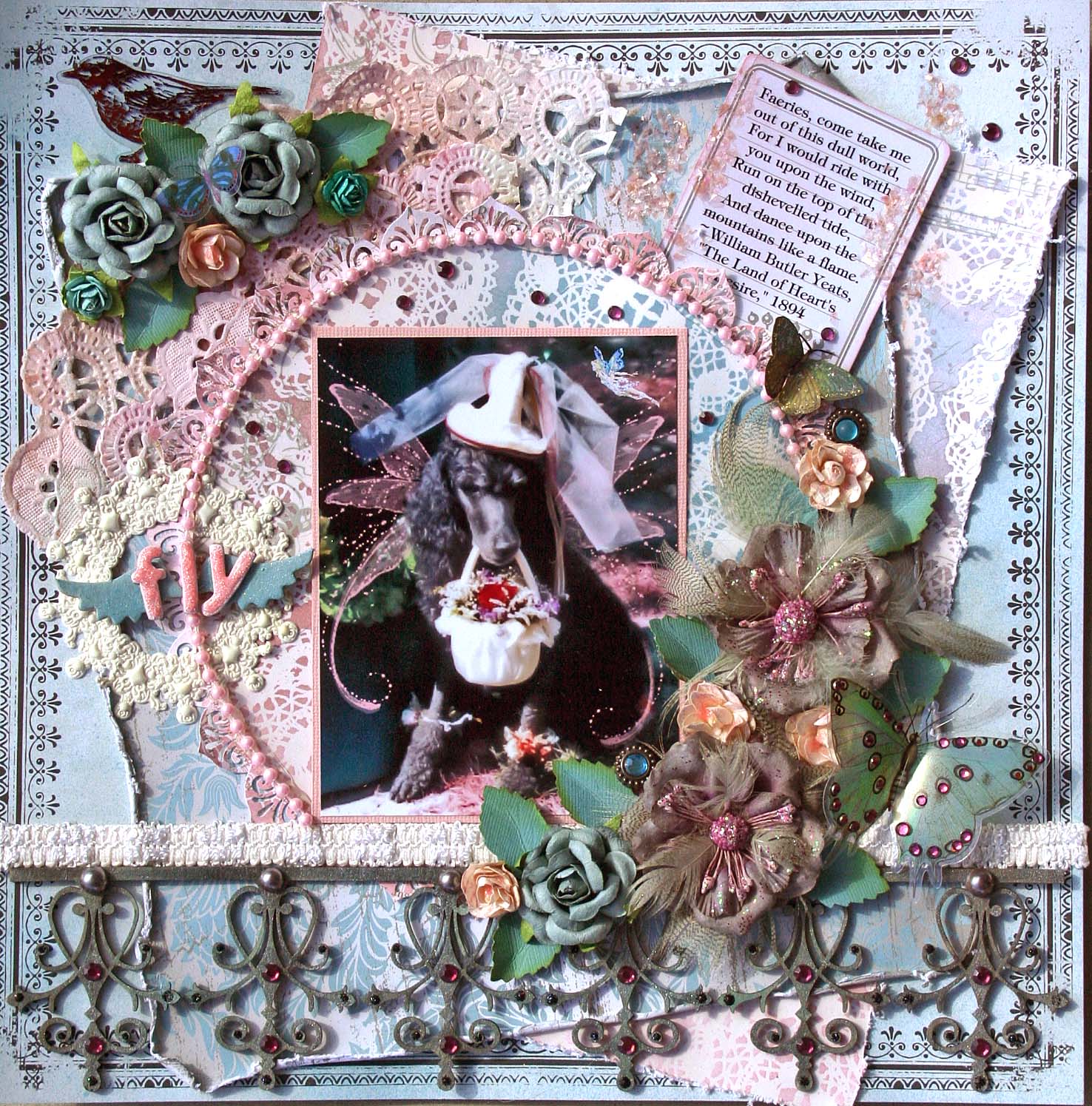
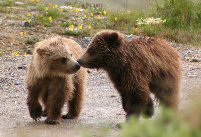
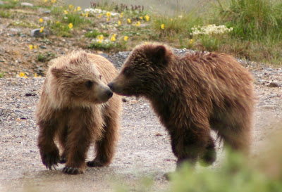
So let's chose a photo. Here's my photo that I'm going to work with:


Let's work with the lighting. Go to Enhance, adjust lighting, levels, and work with the input levels.


In the levels window that opens you will see the caption Input Levels and underneath the graphic image,  black, gray and white triangles.  You can slide these to adjust light, dark and medium tones.  Or, on the right you will see 3 eyedroppers.  Click on the one that is on the far right and is white.  Then click somewhere in your photo that is white.  This should brighten your photo.  If you don't like that result click in the photo somewhere else.  Do the same with the left eyedropper and click on something black in your photo.  Click the center/gray eyedropper to adjust medium tones.  Sometimes, this adjusts the light and dark too radically so I use the trianges and slide them on the slider bar.  You can also click in the boxes underneath the triangles and press the up and down arrows to adjust number values.

There are two other ways to adjust the lighting in your photo. Go to Enhance, Shadows/highlights and work with the three slider bars shown:  Lighten Shadows, Darken Highlights, Midtone Contrast.  Be sure to click the preview box so that you can see the result from your changes.   Rather than using the slider,  I find it easier to click in the boxes where the number %'s are shown and use my up/down arrow keys to  increase/decrease the values.


For the other lighting adjustment, go to Enhance,  Adjust Lighting, Brightness/Contrast and work with the levels in the same manner as the Shadows/highlights.

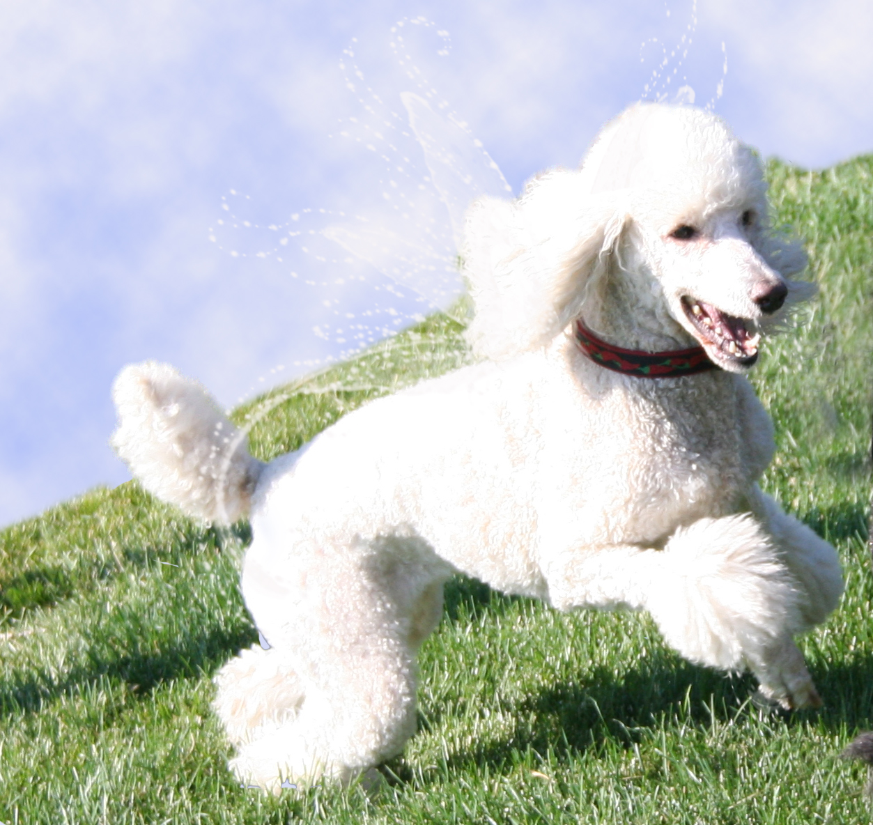
Here is my photo after adjusting lighting levels.

Now that our lighting is the way we want it, lets work on the color.  Sometimes my photos (especially those taken in less than perfect lighting) have a bluish caste to them.  Go to Enhance, Adjust Color, Remove Color Cast.
There are a number of color corrections available in the color drop down menus.  Go to Enhance, Adjust color, adjust hue/saturation. Click in the number box above the Saturation bar and press the up arrow key to pop up your colors a bit.  If the color is just off a bit, try adjusting the hue.  Work with these three sliders to achieve the color levels that please you.


My photo after editing for lighting and color.


Want to change your photo to black and white?  It's easy, just go to Enhance, Adjust color, Remove color.
After converting to black and white, you may need to adjsut the lighting and/or color levels (discussed above) to get just the right look in your photo.

Want to made an antique looking photo in sepia?  Go to Enhance, Adjust Color, Hue/Saturation and near the bottom click the box Colorize.  Adjust the hue and saturation levels to get the sepia color that you want.


I hope this is helpful to you.  If you have questions, please post them here and I will try to help.  Since I am just learning PSE, we can stumble along together!!


Tuesday, February 8, 2011

King of my Heart

Here's a layout I did for a challenge at Crop Suey and at Swirlydoos.  The challenge at Crop Suey was to use 9 different items on a LO.  I think i have 11.

1. Core'dinations cardstock

2. pictures
3. patterned paper
4. chipboard
5. Tim Holtz fragment
6. Tim Holtz tape measure
7. Dymo tape label
8. 7 Gypsies Gears
9. Circle
10. Banner
11. brads

Great challenge!  Here's mine:


Also for the challenge at Swirlydoos to create a LO showing dh at work.  He's always in the garage so that wasn't too hard to do.  But OMG, those jeans he has on!!!

Leibster Blog!


My blog was tagged by my scrappy  friend Shona, Such a Wonderful Mess .  Shona is an awesome Canadian scrapper who says hey instead of eh!  Shona's work is beyond gorgeous so you really should pop over to her blog and check it out!

The Liebster Blog award is given to bring new blogs to light. It's a great way to share blogs that might not otherwise be seen.

If you have been tagged and want to participate, create a post where you post the 'LOVE BLOG' image. Then choose 3 - 5 favourite blogs which you also link in your post.
Here are my 3 picks:

Denise's awesome blog,    Vintage Scrapping

 Pam's wonderful blog, full of all kinds of projects,  Pam's Eclectic Stuff

Christy who does some really creative things, Creatingwiththegirls

Be sure to stop by their blogs and leave some love! 

La Belle Fee

The beautiful fairy -  La Belle Fee.  I made this arch for the Arches challenge at Swirlydoos and for the Tres Chic challenge at Bella Creations.  I just LOVE making these arches.  At 6" tall, they are just the right size to try different techniques without wasting a ton of product if you "mess" up!

 I was having fun with PSE and added the wings to this very sweet standard poodle. She was the flower girl at my poodle's breeder's daughter's wedding and she was just an angel sitting very quietly throughout the entire ceremony. About 20 minutes into the ceremony, she very quietly set the basket of flowers down. Her brother, Saber, was the ring bearer and he was a perfect gentleman as well! Both were better than many children I have seen in weddings. This was such a fun wedding for me for as a child I always dreamed of having a really long train on my wedding gown and having dogs carry my train when I came down the aisle. LOL! Must have been from seeing Lady & the Tramp when I was very young!!

Beautiful Fifi who was a sweetheart of a standard poodle, she is at the rainbow bridge now and I can just see her with these beautiful wings.  I used HOuse of 3 Parisian Anthology paper and inked it with Victorian Velvet distree ink.  The pearls are Prima e. , Dusty Attick chipboard frame painted with tattered rose Distress Crackle Paint.  The flowers have been "glassed" with UTEE, it gives them such a refined look don't you think?


Monday, February 7, 2011

Swirlydoos give away!

Check out Swirlydoos blog here for a chance to win an awesome Bo Bunny give-away full of new products straight from CHA!

Saturday, February 5, 2011

The obsessions continue...

LOL!!!  I really am glad that I am semi-retired because I really am obsessed with the need to create something!  Perhaps it is the artist in me re-emerging after a 40 year nap.  Once upon a time I thought I wanted to be an artist.  Then I went off to college enrolled in the art school.  Oh my, it took about 6 weeks to decide that I was a horrible artist and I hated college.  I stayed through the end of the semester and that was the  end of chapter one in the 12 year saga of Maggi finally gets a degree, in accounting no less.  How DOES one go from being an artist wanta be to a CPA?  Got me, I think I'm out of balance now and back to being an artist! LOL! 

The fun side of what I'm doing these days includes photo editing and that's kind of obsessive too.  Hmmm I think a pattern is emerging here.  OCD anyone??  Well I've been playing around with brushes in PSE and have started working on an angel poodle.  Stay tuned, I'm going to try and write a tut on this once I master it.  Look for it in a few days I'd say!

Well, I hear my other obsession, although often ignored, reading calling me.  Deep into Tom Clancy's and whoever his other writer is, new book.  I'm enjoying it but I fall asleep after reading about 4 pages so I'm not getting far fast!  By the time I finish the book, I will have forgotten the beginning.

And so it goes...

The Mirror

I love this picture of my Mom, it's just very serene, like she is.  The measuring tape ribbon and tiny scissors tucked into the flower are visual references to my Mom's incredible talent as a seamstress and tailor.  There really wasn't anything she couldn't sew and she made so many things for me that I designed including my wedding dress.

This LO was made with the February Swirlydoos kit and it features TPC Studios Grandma's Attic papers.  I made the flower and used a Dress it Up button for the center.Behind the flower is gathered crepe ribbon from Tattered Angels.  The Lace is Reflections and that awesome tree is a Dusty Attic piece that has been inked with chestnut roan and painted with glimmer mist.

Adore - my grandparents

Did this one for the February sketch challenge at Swirlydoos and also for a challenge at Sisterhood of Scrap using the really beautiful SD's February kit.  This is a picture of my maternal grandparents that I love.  I just love this new Core'dinations paper with the clockfaces on it!  Also used TPC Studios Grandma's Attic Embroidery and Reflections, Pink Paislee journal tag, MM Brun Antique Dictionary, Prima felt border, .  I made the gree flowers and used a Prima center for two of them.  The vine is also Prima and the black flowers are Petaloo velvets.   Oh and there's a Prima flower ribbon on the felt border.  TFL!!

Friday, February 4, 2011

Beware the Black Widow

This has to be one of my all time favorite images, the lady in red.  My version is a hybrid as I added the spider and web.  When I look at the picture I just think of a mysterious heartbreaking woman that is kind of evil - hence the title.


This is for an arches challenge at Swirlydoos.  I've not heard of arche before but I sure do love the concept.  They are 6" tall, so a bit larger than an ATC, I love that, more real estate!  On this I used alot of silver ink to color the dusty attic chipboard chandalier and the leaves on the flower were a bronzy color until I took the silver inkpad to them!  The flower is really cool IRL as it has the effect of being glassed.  I did that by covering it heavily with clear UTEE.  It is awesome, you should try it!  Too bad you can't really see it, but I highlited the spider web with black diamonds stickles and it looks cool IRL.  I love this, I love black and red so go figure. LOL!!  TFL!!


Lady -Arch with G45

Oh was this an ever fun and new project, it's an arch and is just a 6" piece of artwork using G45's Steampunk pps.   So while I was building this arch my imagination decided that "Lady" is a woman who lives in a belfrey and only comes out at night.


The stained glass piece at the top I made by first using a Cuttlebug die to cut the black frame.  I heat embossed that  using clear UTEE.  Then I took a square transparency and stained it with Ranger alcohol ink.  I put a piece of white paper behind that as the stain just didn't show up well enough without it.  The birds are stamped using a Tim Holtz stamp.  The chipboard is a Dusty Attic piece sprayed with glimmer mist and stickles added to highlight.  The arch is also outlined with blakc diamond stickles.  IRL the DA chippie is a darker color that matches the rest of the piece. There are two Timmy fragments dangling from the bottom.  Finally since I thought we were peaking into Lady's world, I added black netting to add a layer of mystery.  TFL!!

Wednesday, February 2, 2011

Tutorial for adding a border trim to a circle

This is such an easy thing to do but thought I would share it with you.


1.Cut out a border strip using whatever border punch you want. Below I have cut two different borders just to show that each will work.

                                                                                                                                                                                         .


2. Cut the punched border strip into segments as pictured. It looks good to ink the segments particularly if you are using paper with a white core


3. Glue the individual segments to the backside of the circle:


4.  And that's all there is to it, easy and it looks great.


Here's a layout I did using this technique to go around the diecut on the left.


LinkWithin

Related Posts Plugin for WordPress, Blogger...